Quick clarity
People return to card pages to verify their status, not to browse decorative content.
SAVVII / 2022—2023
Redesigning card management for a cleaner, faster, and more controlled digital banking experience.

00 / Overview
The “My Card” surface should work as a quick financial checkpoint—not a page to explore.
I redesigned the experience to foreground balance, amount due, available credit, and payment actions while progressively layering settings and security-sensitive controls. The goal was simple: reduce noise, support faster verification, and make high-intent moments feel controlled.
People return to card pages to verify their status, not to browse decorative content.
Balance, due amount, and available credit need to appear before the first scroll.
Decorative components become friction when they dominate the most valuable space.
01 / Problem
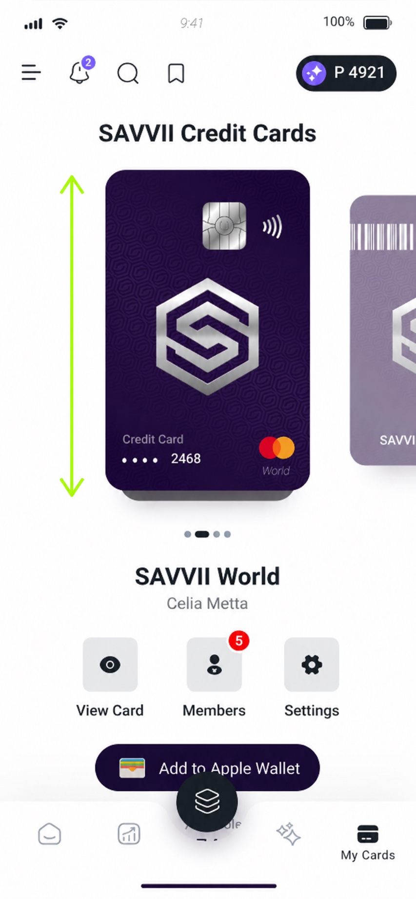
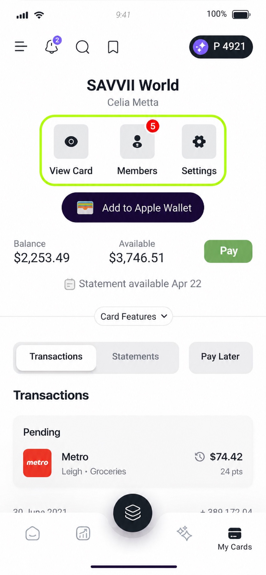
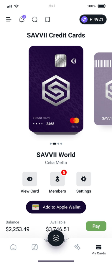
An oversized decorative card consumed most of the first viewport, pushing the financial state below the fold.
Users had to scroll and scan before they could answer the simplest question: “Where does my card stand?”
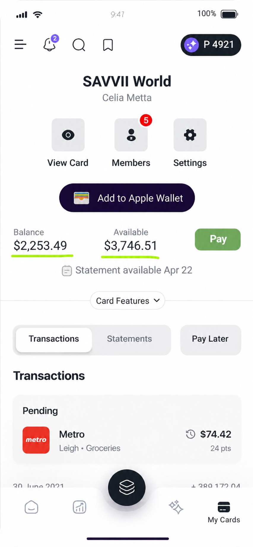
Balance, due amount, available credit, and card actions were fragmented across modules with similar visual weight. The screen had the right pieces, but no clear decision order.
Design question
How might the card page answer the user’s financial question before asking them to navigate or interpret the interface?
Problem diagnosis / 04
01 / 04
Problem #1
Problem #2
Problem #3
Problem #4
02 / Decisions
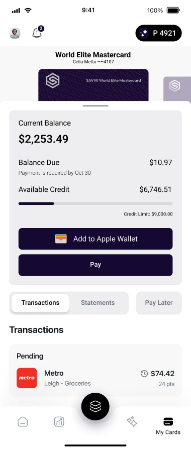
I changed the reading order from “see the card, then find the data” to “understand the state, then choose the next action.” Balance, amount due, available credit, and payment now form one clear financial block.
Business goals
User goals
Process / 04 decisions
01 / 04
Process #1
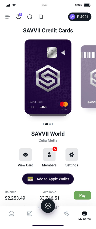
The original experience treated the card as the centrepiece of the page.
I reframed the surface around decision-making instead; prioritizing the information users check most frequently, such as balance, due amount, and available credit.
The redesign shifts the interface from decorative presentation toward functional clarity.
Process #2
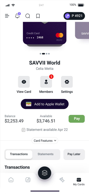
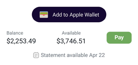
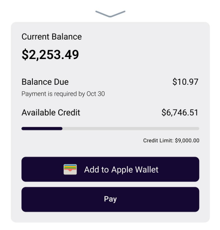
The previous layout treated financial details and actions with almost equal weight. As a result, the Pay button was easy to overlook, despite being one of the most important user tasks.
I redesigned the structure so users can first understand their card status, then immediately act on it. Balance, due amount, and available credit are grouped into one readable section, while the Pay button is positioned as a clear primary action beneath the financial summary.
Process #3
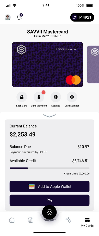
Secondary actions like Lock Card, Members, Settings, and Card Number were still important, but they did not need to compete with the main card information at all times.
Instead of exposing every action upfront, I moved these controls into a layered interaction. Users can reveal them when needed, while the default state stays focused on the card, balance, and payment tasks.
This reduces visual noise without hiding functionality.
Process #4
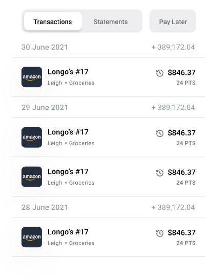
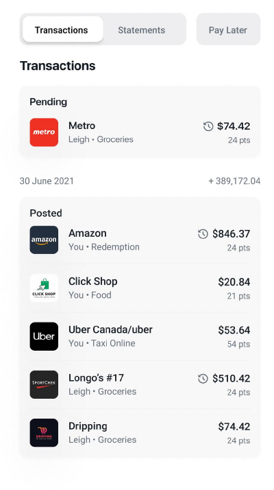
Previously, transactions were displayed as a flat chronological list. Pending and posted activity shared the same visual treatment, requiring users to read line by line to understand transaction status.
The redesign separates Pending and Posted activity. Pending transactions are surfaced first, while posted transactions form a structured section below—creating a clearer hierarchy and making the transaction view easier to review at a glance.
03 / Final design
The final experience shifts the focus from decorative presentation to financial readability. A single status block connects current balance, balance due, available credit, and payment.
Secondary and security-sensitive actions are progressively layered, reducing noise without sacrificing access or control.
Final product / In motion
The prototype shows the redesigned reading order, clearer transaction hierarchy, and a more intentional approach to secondary card controls.
04 / Outcome
The redesign gives each element a clearer job: financial information explains the state, primary actions support the next decision, and secondary controls remain available without competing for attention.
01
Balance, due amount, available credit, and payment actions are visible together instead of across fragmented modules.
02
Decorative elements and secondary actions no longer compete with the information users came to verify.
03
Security-sensitive actions are layered progressively, preserving access while reducing uncertainty.
04
Pending and posted transactions form clearer groups that are easier to scan and review.
What this project reinforced
Correct information can still feel uncertain when its hierarchy does not match the user’s question.
Progressive layering can reduce noise without reducing functionality.
People arrive to verify, act, and leave; the interface should support that rhythm.
Next project
04 / 08UX research · 2022